
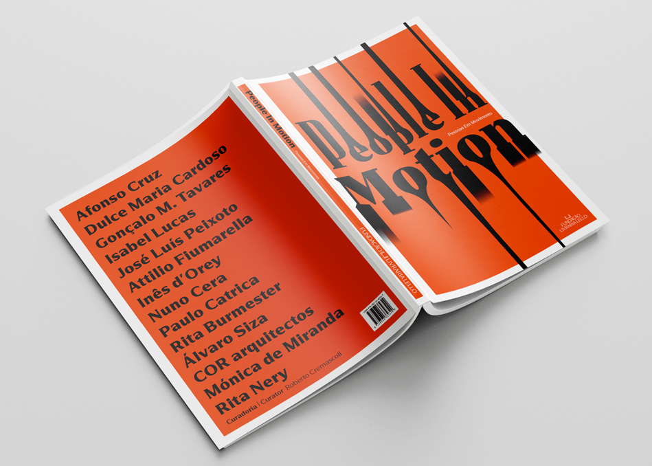
Exhibition graphics, identity, and catalogue design for “People In Motion” at Fundação Livraria Lello. Featuring works by Álvaro Siza, Afonso Cruz, Dulce Maria Cardoso, Gonçalo M. Tavares, Isabel Lucas, José Luís Peixoto, Attilio Fiumarella, Inês d’Orey, Nuno Cera, Paulo Catrica, Rita Burmester, Mónica de Miranda, and Rita Nery.
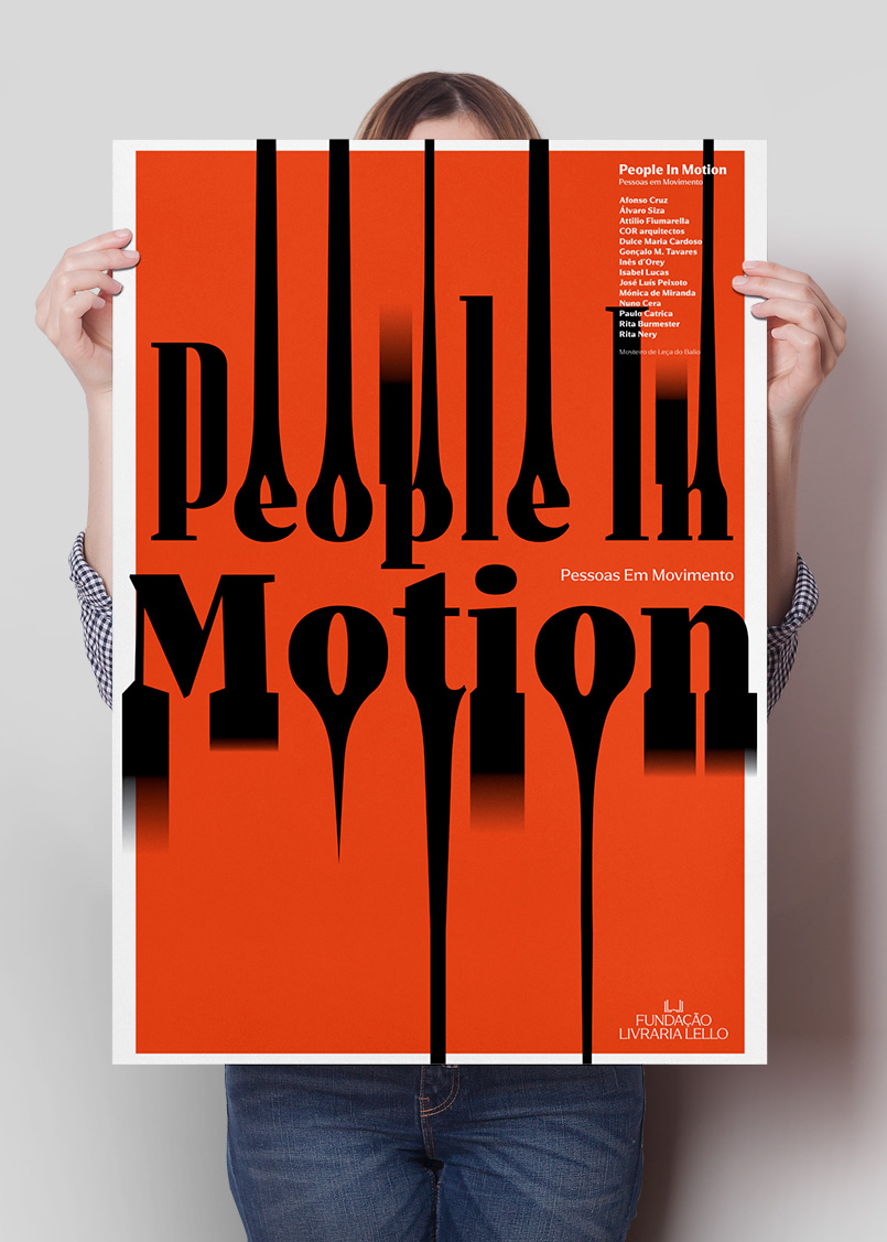
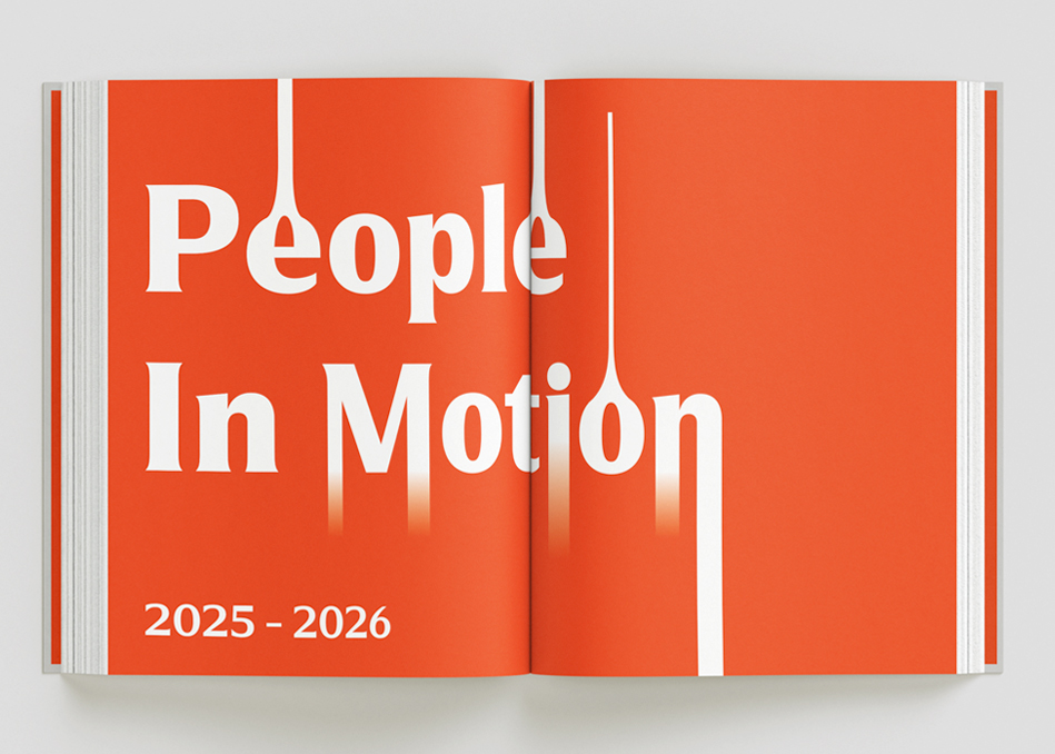
The design translates the exhibition’s focus on movement, understood as physical displacement, perceptual shift, and cultural circulation. The central typographic choice was simple: stretch the lettering to the edge of whatever surface it appeared on. That created a sense of movement and made the identity easy to adapt from poster to catalogue to street banner.
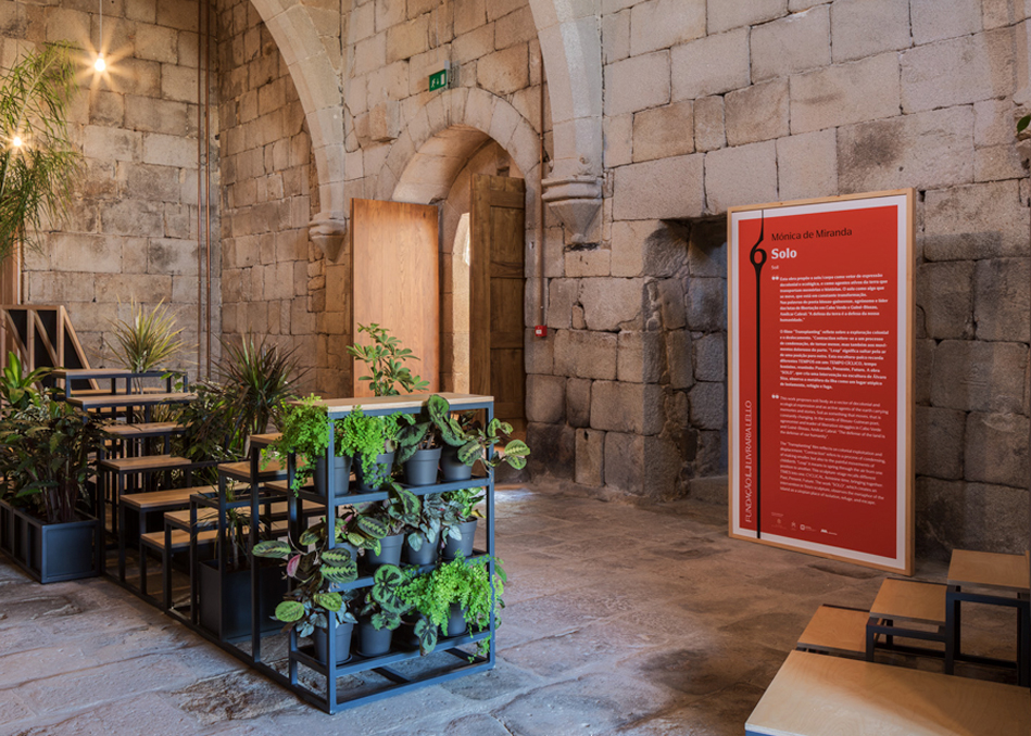
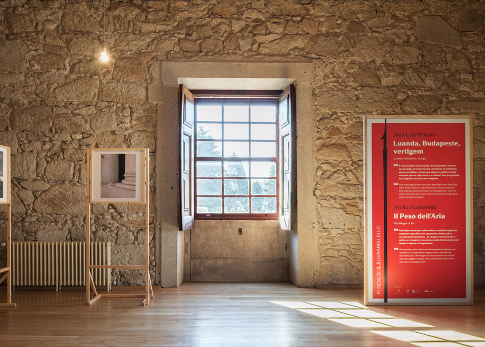
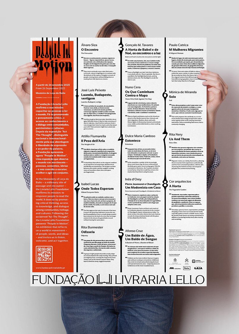
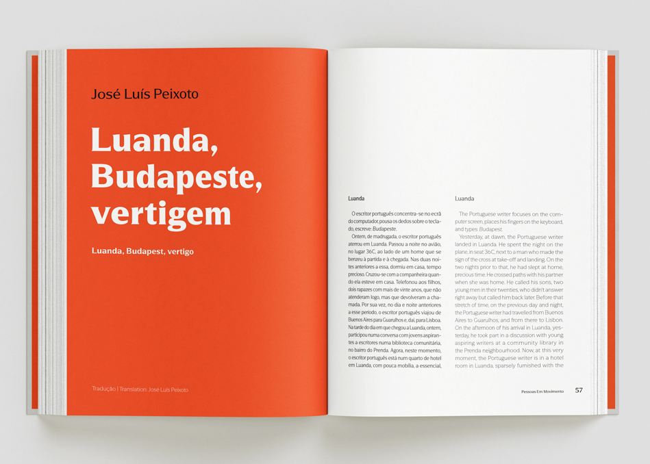
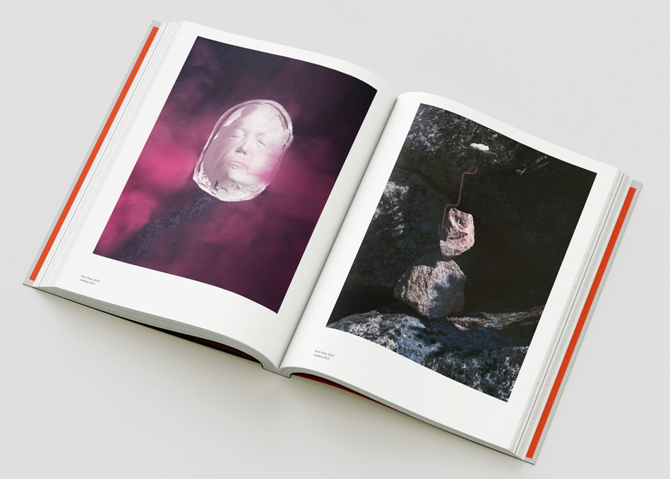
The catalogue brings together short stories, photography essays, architectural drawings, and documentation of the final exhibition setup. Each contribution keeps its own character while sitting within a single, unified object.
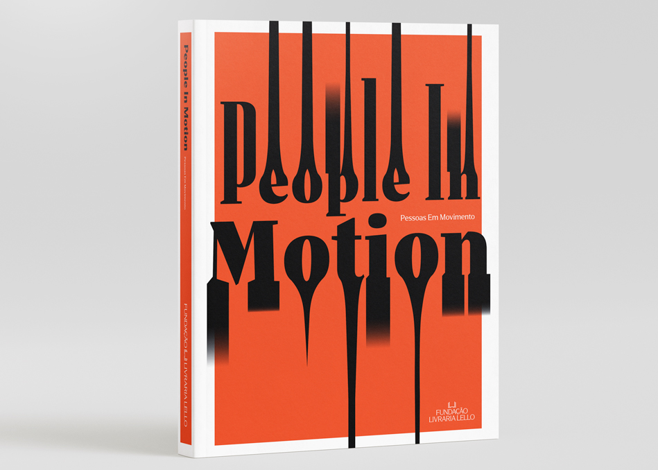
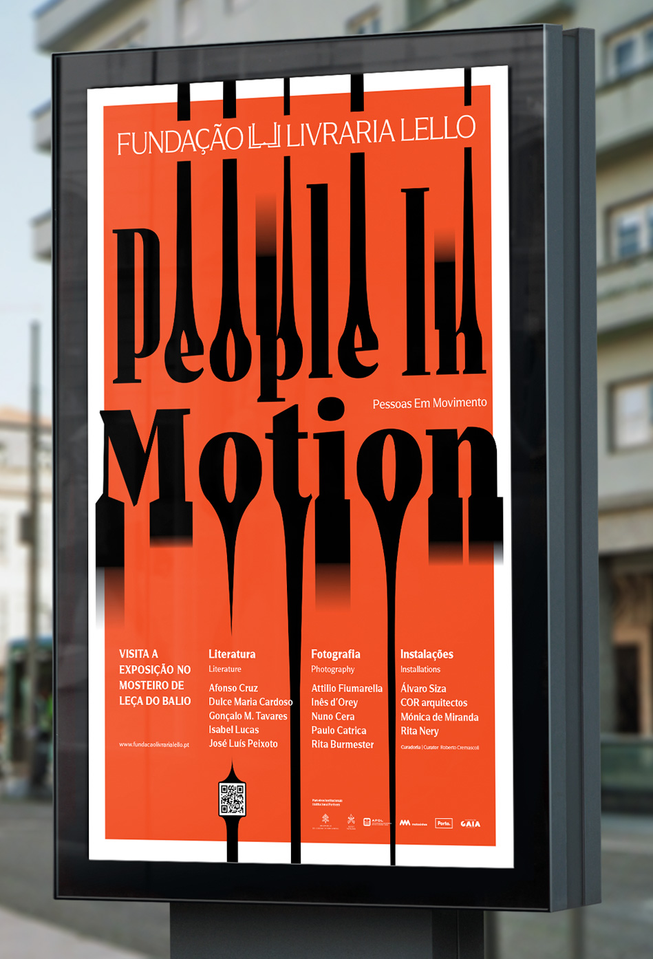
O design traduz a ideia de movimento (entendido aqui como deslocação, transformação e circulação cultural) numa linguagem gráfica assente no movimento, dado pelas distorções tipográficas criam uma sensação de fluidez, evocando visualmente a ideia de corpos e narrativas em trânsito.
O catálogo da exposição alterna entre capítulos de texto e fotografias, permitindo que cada contribuição mantenha a sua autonomia, mas articuladas num projeto editorial coerente. O resultado é um objeto que reforça a continuidade entre disciplinas como a arquitetura, a literatura e a fotografia, preservando uma linguagem gráfica contemporânea.